Tips for Creating an Effective Website Home Page

It is possibly the most important page on your website. It should immediately tell visitors to your site who you are and what you do. It needs to inform, inspire as well as give a strong call to action as to what the visitor should do next. Is your website home page up to the task?
#1 Is it easy to navigate with a clean layout?
Your home page is a bit like making a speech when you are nervous – do you let all those words tumble out or do you try and order what you need to say? The important stuff needs to come first and it shouldn’t be hidden behind a load of clutter and words.
Choose a layout that is clean and easy to navigate, keeping images and clipart to a minimum. Sometimes, less really is more.
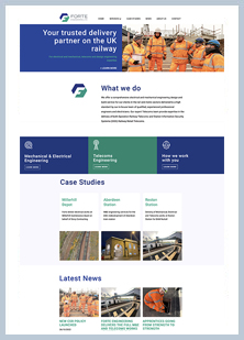
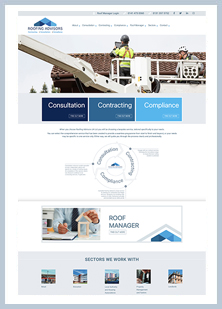
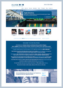
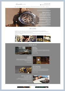
#2 Are the images high quality and relevant?
A picture says a thousand words or it can say nothing at all. Or it can say ‘I’m filling this space because someone thought it looks too bare’.
Any photos you use on your home page should be there for a reason. They should support your business and what it needs to say on the home page – that is, who you are and what you do. If an image hasn’t or isn’t earning its place, replace it or just remove it.
And no matter what images you use, there is no excuse for grainy, slightly out of focus low-resolution images. Without sugaring it, poor quality images put people off.
#3 Are you using the right colours?
There is a whole school of thought behind the psychology of colour and what a certain colour says to your consumer.
Aside from making sure you have the right colour scheme for your brand and customer demographic, you also need to be confident this brand persona is reflected strongly in your home page.
Here’s the thing: some brands spend a lot of time creating a brand kit whilst others spend next to nothing. Either way, if what people see in your adverts don’t match with what they see on your home page, there is a fundamental disconnect.
Secondly, as well as a brand persona, you also need to check that the colours work well together and that they look great on your home page when viewed as a customer.
#4 Is your call to action strong and clear?
A call to action is short, concise set of instructions as to what the person should do next. Do they need to buy now? Or do they need to learn more? Should they follow you for great discounts?
The call to action needs to be strong – keep it under four words because the more direct and clear the better – and the steps to getting where they need to be also need to be clear and minimal. If someone needs to think too much or navigate something too complicated, they’ll navigate to a competitor.
#5 Do you update your home page?
There is a tendency, and we understand why in some ways, that when the home page is written, that’s it. It is set in stone. Job done.
It doesn’t need to. Occasional and regular updates of the home page content wouldn’t go amiss, especially if keywords have changed.
Does your homepage need an overhaul? The web design team at Jollie Design can help!
how we work

our latest projects